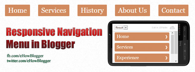
Responsive Web Design (RWD) is aimed to optimize your website for not for only desktop browsers as well as mobile and other devices for optimal user experience. Now a days, Responsive Web Designing is trending world wide and year 2013 is said to be a year of responsive designing. The use of hand held devices mobile phones, tablets etc. is increasing and people around the world are like to surf online on these devices. First step toward Responsive Designing is to create a responsive navigation menu. Menu below is created by using CSS media queries.


